UX/UI/ Research
Recipedia App
From Insight to Interface: Solving Meal Prep with UX
TL;DR — Recipedia is a UX design and frontend development project that helps busy families generate meal ideas based on their pantry. I led UX research, design, prototyping, and built the live MVP using Hugo, HTML, CSS, and JS. The app simplifies meal prep with personalized recipe bundles and is currently evolving into a more dynamic and accessible tool.
View Site❔The Problem
Busy families struggle with meal planning, especially when time, creativity, and dietary needs are limited. While many platforms offer recipe inspiration, few cater directly to what people already have in their kitchens.
🎯 The Goal
The goal was to build an app that generates recipes based on a user’s current food inventory, reducing decision fatigue and supporting dietary restrictions. Success was measured through usability testing and satisfaction surveys.
🛠️ My Responsibilities
Lead UX Designer & Researcher: Defined objectives, identified the target audience, created wireframes, prototypes, and conducted usability testing throughout the design process.
Web Application Developer: Developed and maintained the live web application, ensuring it adhered to UX design standards, managed hosting, and performed QA checks.
🔍 User Research & Key Findings
Interviews revealed that users typically resort to platforms like Pinterest or YouTube for meal ideas. The market lacked a tailored recipe generator that felt intuitive and accessible.
Key pain points:
Lack of Creativity: Users struggled to come up with meal ideas from common ingredients.
Dietary Restrictions: Finding suitable recipes was difficult for users with specific dietary needs.
Cost of Delivery Services: Users liked the idea of food delivery but were deterred by high fees.
Kitchen Safety: Concerns about safety while cooking, especially with children or multitasking, highlighted a need for built-in tools like timers.
🧩 Initial Design Objectives
I started with paper wireframes, testing various homepage layouts, and opted for a large call-to-action to drive users straight to the recipe generator.
Digital wireframes introduced secondary options like exploring recipes by category. The app was designed to minimize the number of pages, keep cognitive load low, and present recipes in small bundles to reduce decision fatigue.
🧪 Prototyping & Testing
Low-fidelity prototypes were tested with users performing key tasks:
Generate a recipe.
Add ingredients via photo input.
Find favorite recipes.
Change dietary preferences.
We tracked:
Time taken to find the recipe generator.
Back button vs. home button usage.
Task completion rates and confidence levels.
System usability scores and drop-off points.
Key takeaways included the need for clearer icons, more consistent copywriting, and an optional tutorial for onboarding less tech-fluent users.
🎨 High-Fidelity Prototype & Refinements
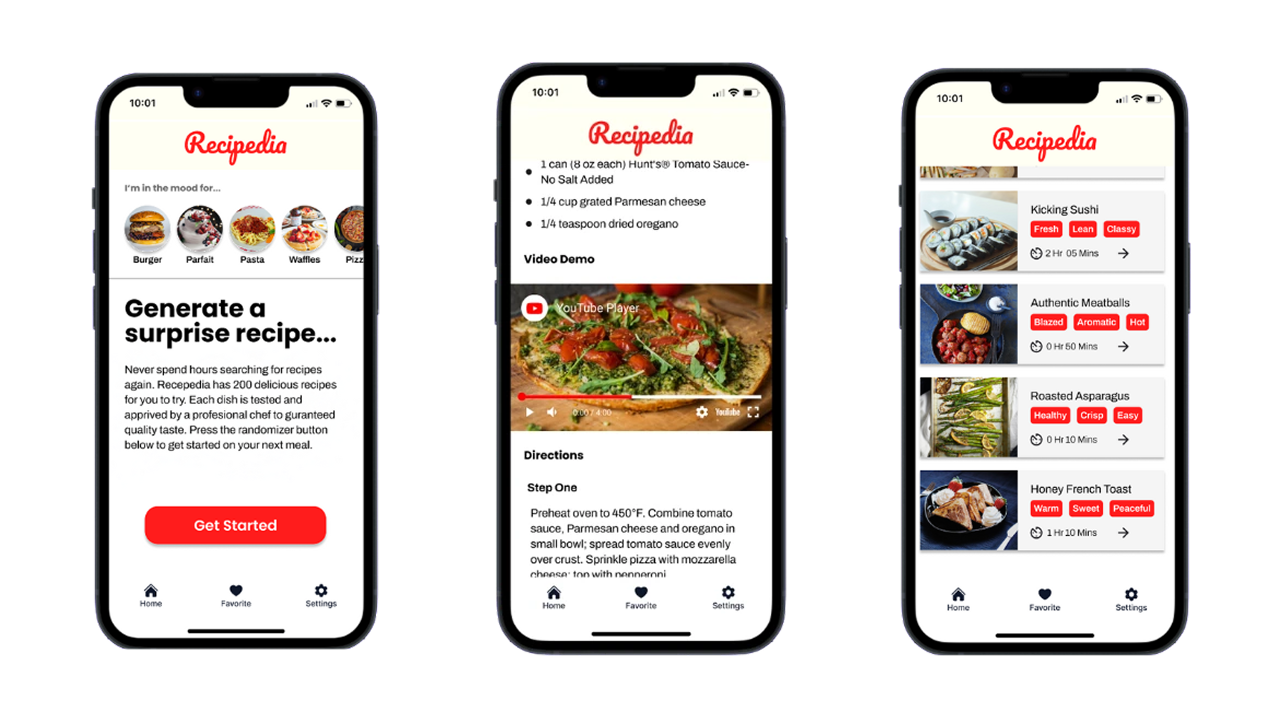
Based on feedback, I improved:
Navigation with updated, intuitive iconography.
Consistent and action-oriented UX copywriting.
Onboarding tutorial screens.
Accessibility with better contrast and text sizing.
💻 Development & Tech Stack
Recipedia currently exists as a frontend-only MVP built with:
Hugo for templating and site generation.
HTML, CSS, JavaScript for structure and interactivity.
The app uses markdown files as a simple data layer, taking advantage of Hugo's speed, accessibility, and Lighthouse performance. It includes pagination and category filtering.
✨ Why This Matters
Recipedia bridges my UX design expertise with practical web development skills. It reflects how I identify real-world problems, apply thoughtful design, and build solutions that continue to evolve. It’s a product I use daily, reminding me that good design starts with empathy and grows through iteration.
🔗 Explore More
If you enjoyed this case study, check out my other projects below.
Other Projects